
Published on Friday, June 13, 2025
How to Configure next-themes in a Next.js App
Posted by
Introduction
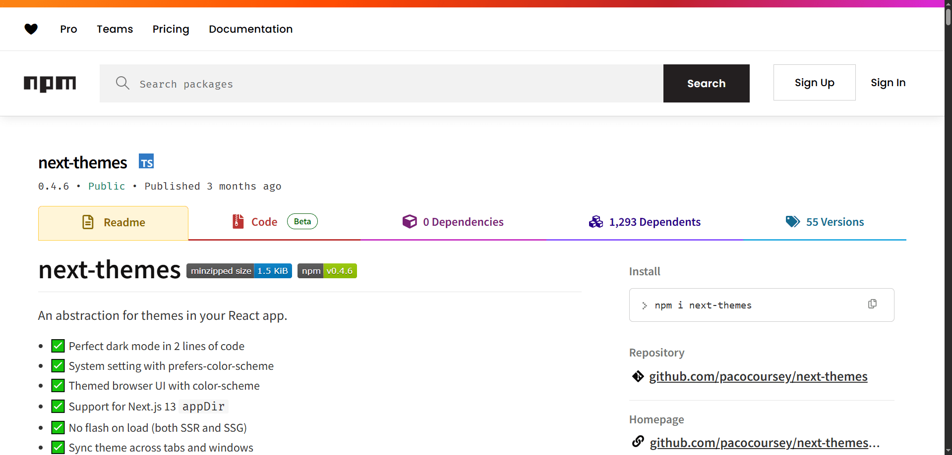
Dark mode is now a standard feature in modern web apps. Fortunately, next-themes makes it incredibly easy to implement dark mode in your Next.js application. When combined with Shadcn UI, it creates a smooth developer experience and polished UI.co
In this tutorial, we’ll walk through how to:
- Install
next-themes. - Configure it in a
Next.jsapp. - Integrate it with
Shadcn UIcomponents. - Add a theme
togglebutton.
Install Dependencies
If you haven’t already, set up a Next.js project:
npx create-next-app@latest my-app --typescript
cd my-app
Then, install the required packages:
npm install next-themes
Make sure Shadcn UI is also installed:
npx shadcn-ui@latest init
During setup, choose
tailwindas your CSS framework and ensure thethemeis set toclassintailwind.config.js.
Configure ThemeProvider
Create a components/theme-provider.tsx file:
"use client";

import React from "react";
import {
    type ThemeProviderProps,
    ThemeProvider as NextThemesProvider,
} from "next-themes";

const ThemeProvider: React.FC<ThemeProviderProps> = ({
    children,
    ...props
}) => {
    return <NextThemesProvider {...props}>{children}</NextThemesProvider>;
};

export default ThemeProvider;
Wrap Your App with ThemeProvider
Update your app/layout.tsx (or _app.tsx if using the pages router):
import type { Metadata } from 'next'

import './globals.css'
import { ThemeProvider } from '@/components/theme-provider'

export const metadata: Metadata = {
  title: 'My App',
  description: 'Using next-themes with Shadcn UI',
}

export default function RootLayout({
  children,
}: {
  children: React.ReactNode
}) {
  return (
    <html lang="en" suppressHydrationWarning>
      <body className="min-h-screen bg-background font-sans antialiased text-foreground">
        <ThemeProvider
						attribute="class"
						defaultTheme="system"
						enableSystem
				>
          {children}
        </ThemeProvider>
      </body>
    </html>
  )
}
Setup tailwind.config.js
Ensure your Tailwind config is using the class strategy:
module.exports = {
  darkMode: 'class', // Important!
  content: ['./app/**/*.{js,ts,jsx,tsx}', './components/**/*.{js,ts,jsx,tsx}'],
  theme: {
    extend: {},
  },
  plugins: [],
}
Add a Theme Toggle Button
You can now add a toggle using Shadcn UI’s Button and Switch components.
'use client'

import React from 'react'
import { useTheme } from 'next-themes'
import { Moon, Sun } from 'lucide-react'

import {
    DropdownMenu,
    DropdownMenuItem,
    DropdownMenuTrigger,
    DropdownMenuContent,
} from '@/components/ui/dropdown-menu'
import { Button } from '@/components/ui/button'

const ThemeToggler: React.FC = () => {
    const { setTheme } = useTheme();

    return (
        <DropdownMenu>
            <DropdownMenuTrigger asChild>
                <Button size="icon" variant="outline">
                    <Sun className="h-[1.2rem] w-[1.2rem] rotate-0 scale-100 transition-all dark:-rotate-90 dark:scale-0" />
                    <Moon className="absolute h-[1.2rem] w-[1.2rem] rotate-90 scale-0 transition-all dark:rotate-0 dark:scale-100" />
                    <span className="sr-only">Toggle theme</span>
                </Button>
            </DropdownMenuTrigger>
            <DropdownMenuContent align="end">
                <DropdownMenuItem onClick={() => setTheme("light")}>
                    Light
                </DropdownMenuItem>
                <DropdownMenuItem onClick={() => setTheme("dark")}>
                    Dark
                </DropdownMenuItem>
                <DropdownMenuItem onClick={() => setTheme("system")}>
                    System
                </DropdownMenuItem>
            </DropdownMenuContent>
        </DropdownMenu>
    );
};

export default ThemeToggler;
Now use it in your navbar or any layout:
// components/navbar.tsx
import ThemeToggle from './theme-toggle'

export default function Navbar() {
  return (
    <nav className="flex justify-end p-4 border-b">
      <ThemeToggle />
    </nav>
  )
}
Conclusion
With just a few steps, you can enable dark mode in your Next.js app using next-themes and Shadcn UI. It's lightweight, customizable, and production-ready.
If you're building a modern UI and want theme support out-of-the-box, this is the cleanest approach.