
Published on Monday, December 30, 2024
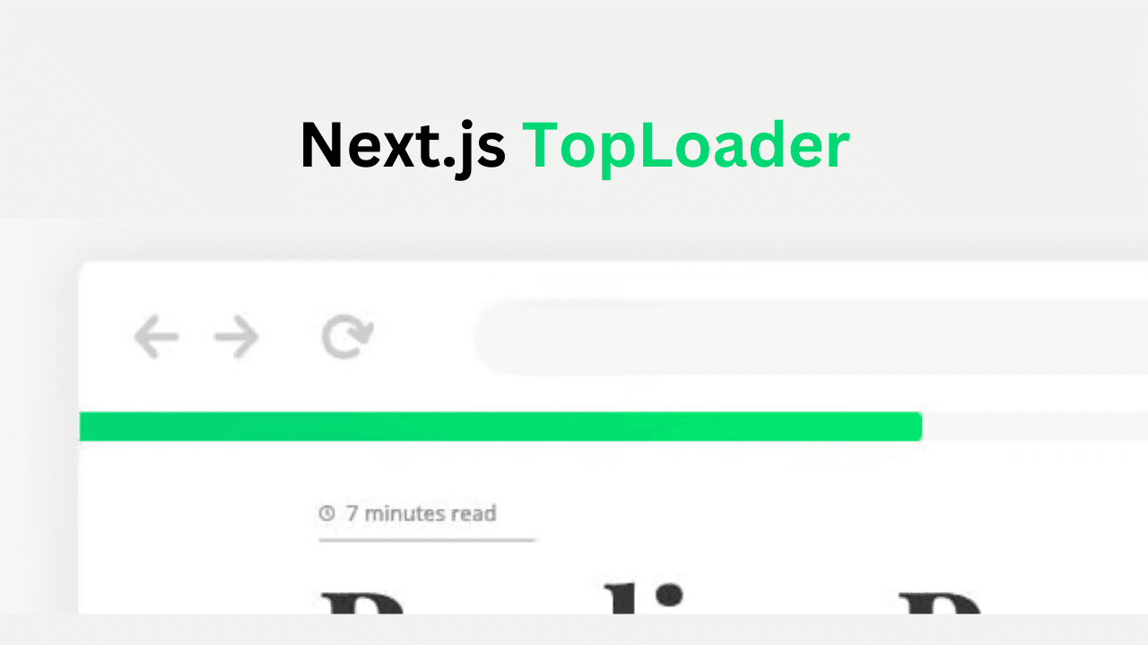
Next.js TopLoader: Add Smooth Page Transitions Easily
Posted by
Video Tutorial
Prerequisites
To follow along, ensure you have the following:
Step 1: Installation
Use your preferred package manager to add the library to your project:
npm install nextjs-toploader
Step 2: Configure Toploader
Once you've installed nextjs-toploader, it's time to integrate it into your Next.js application.
// app/layout.tsx
import NextTopLoader from 'nextjs-toploader'

export default function RootLayout({ children }) {
  return (
    <html>
      <body>
        <NextTopLoader />
        {children}
      </body>
    </html>
  );
}
Step 3: Customize TopLoader
You can easily customize the nextj-toploader by adjusting its props. Here’s a brief overview of key options:
<NextTopLoader
  color="#000"                 // Loader color
  speed={100}                  // Faster transitions
  showSpinner={false}    // Show spinner icon
  easing="ease-out"       // Smooth animation easing
  showAtBottom={true}   // Position at the bottom
/>
Step 4: Compatibility with useRouter hook
For triggering TopLoader when using useRouter hook:
// Import the useRouter hook from nextjs-toploader to trigger the TopLoader
import { useRouter } from 'nextjs-toploader/app'

// Then simply use it in your code for example:
const router = useRouter()
router.push('/some-page')
Compatible with other React based Framework
Integrate NextTopLoader in any React-based framework like Vite or CRA by simply adding the <NextTopLoader /> component to your main file.
import NextTopLoader from 'nextjs-toploader'

const App = () => {
  return (
    <div>
      <Router>
        <NextTopLoader />
        <Routes>{/* Your Routes Here */}</Routes>
      </Router>
    </div>
  );
}
Default Configuration
If no props are passed to <NextTopLoader />, below is the default configuration applied.
<NextTopLoader
  color="#2299DD"
  initialPosition={0.08}
  crawlSpeed={200}
  height={3}
  crawl={true}
  showSpinner={true}
  easing="ease"
  speed={200}
  shadow="0 0 10px #2299DD,0 0 5px #2299DD"
  template='<div class="bar" role="bar"><div class="peg"></div></div>
  <div class="spinner" role="spinner"><div class="spinner-icon"></div></div>'
  zIndex={1600}
  showAtBottom={false}
/>
Props (NextTopLoader Component)
| Prop | Type | Default | Description |
|---|---|---|---|
color | string | #2299DD | Sets the loader color |
initialPosition | number | 0.08 | Sets the initial position of the loader |
crawlSpeed | number | 200 | Sets the speed of the auto-increment |
height | number | 3 | Sets the height of the loader |
crawl | boolean | true | Enables auto-increment behavior |
showSpinner | boolean | true | Shows or hides the spinner icon |
easing | string | ease | Sets the easing function for animation |
speed | number | 200 | Sets the animation speed |
shadow | string | false | Sets the shadow effect |
template | string | " " | Allows custom HTML for the loader template |
zIndex | number | 1600 | Sets the z-index for the loader |
showAtBottom | boolean | false | Display the loader at the bottom |
showForHashAnchor | boolean | true | Shows the loader for hash anchor links |
Conclusion
nextjs-toploader is an easy-to-implement solution for enhancing user experience across React-based frameworks like Vite, Create React App, and Next.js. With minimal setup, it provides a smooth loading bar during page transitions, making your application feel faster and more responsive. Customize it to match your design, and enjoy seamless navigation with just a few lines of code.